"I'm Just A Girl, Not A Threat" – "Oh Ellie, I Think They Should Be Terrified Of You."
The Last of Us Part II: Ellie x Dina
August 2020
Fan art inspired by The Last of Us Part II, developed by Naughty Dog and published by Sony Computer Entertainment.
Client: Private Commission (Brittany Dailey).
Not for sale.
Synopsis: Set five years after The Last of Us (2013), the game focuses on two playable characters in a post-apocalyptic United States whose lives intertwine: Ellie (Ashley Johnson), who sets out for revenge after suffering a tragedy, and Abby (Laura Bailey), a soldier who becomes involved in a conflict between her militia and a religious cult. Directed by Neil Druckmann, Anthony Newman and Kurt Margenau. Written by Neil Druckmann and Halley Gross.
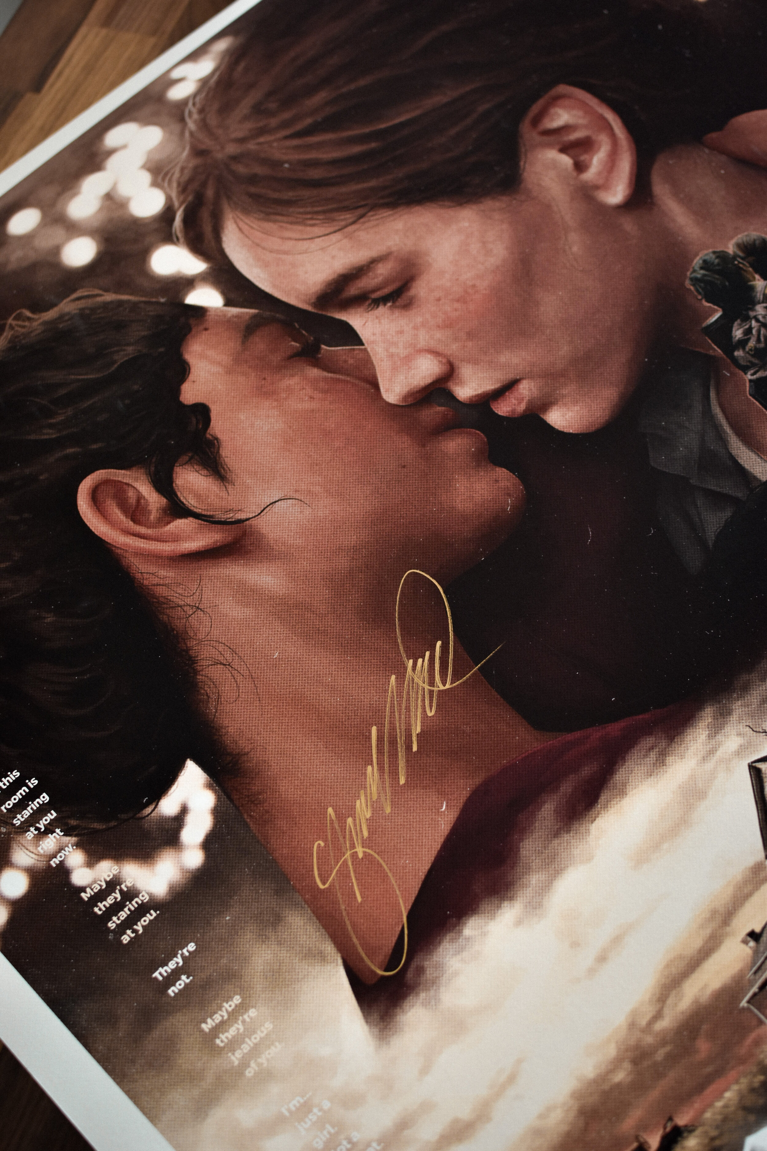
This print revolves around the relationship between Ellie (Ashley Johnson) and Dina (Shannon Woodward).
Signed by Shannon Woodward (Dina).
Creative Process.
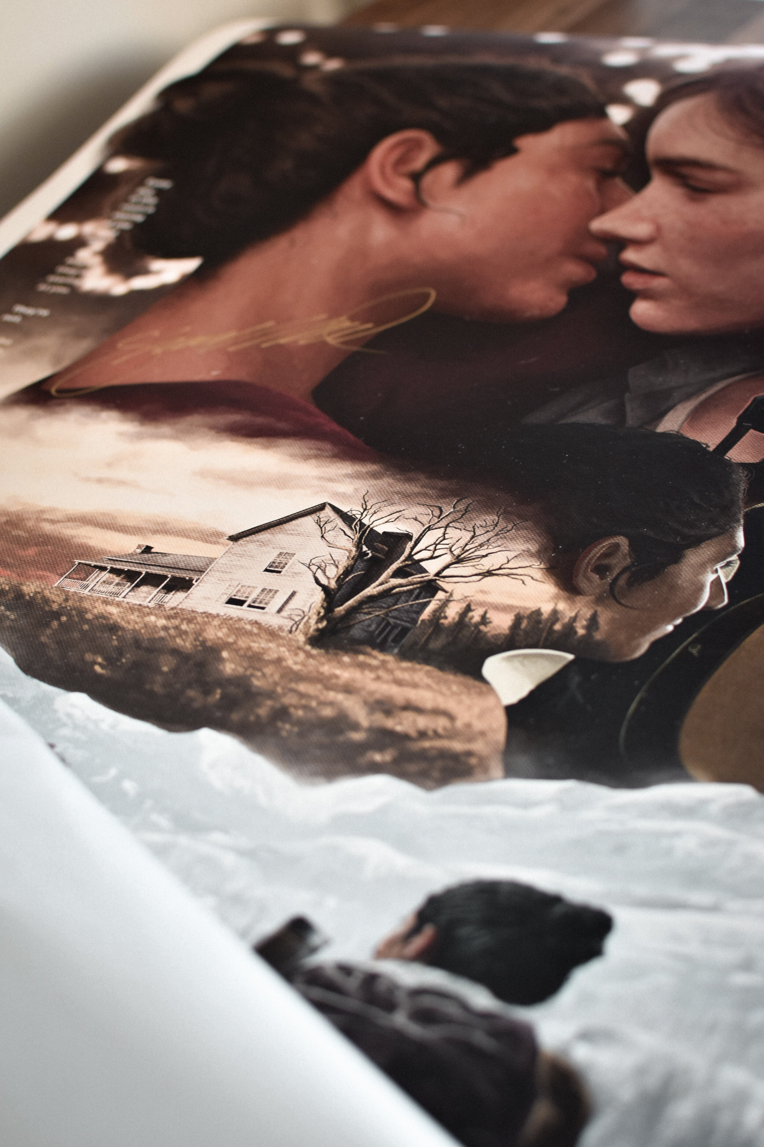
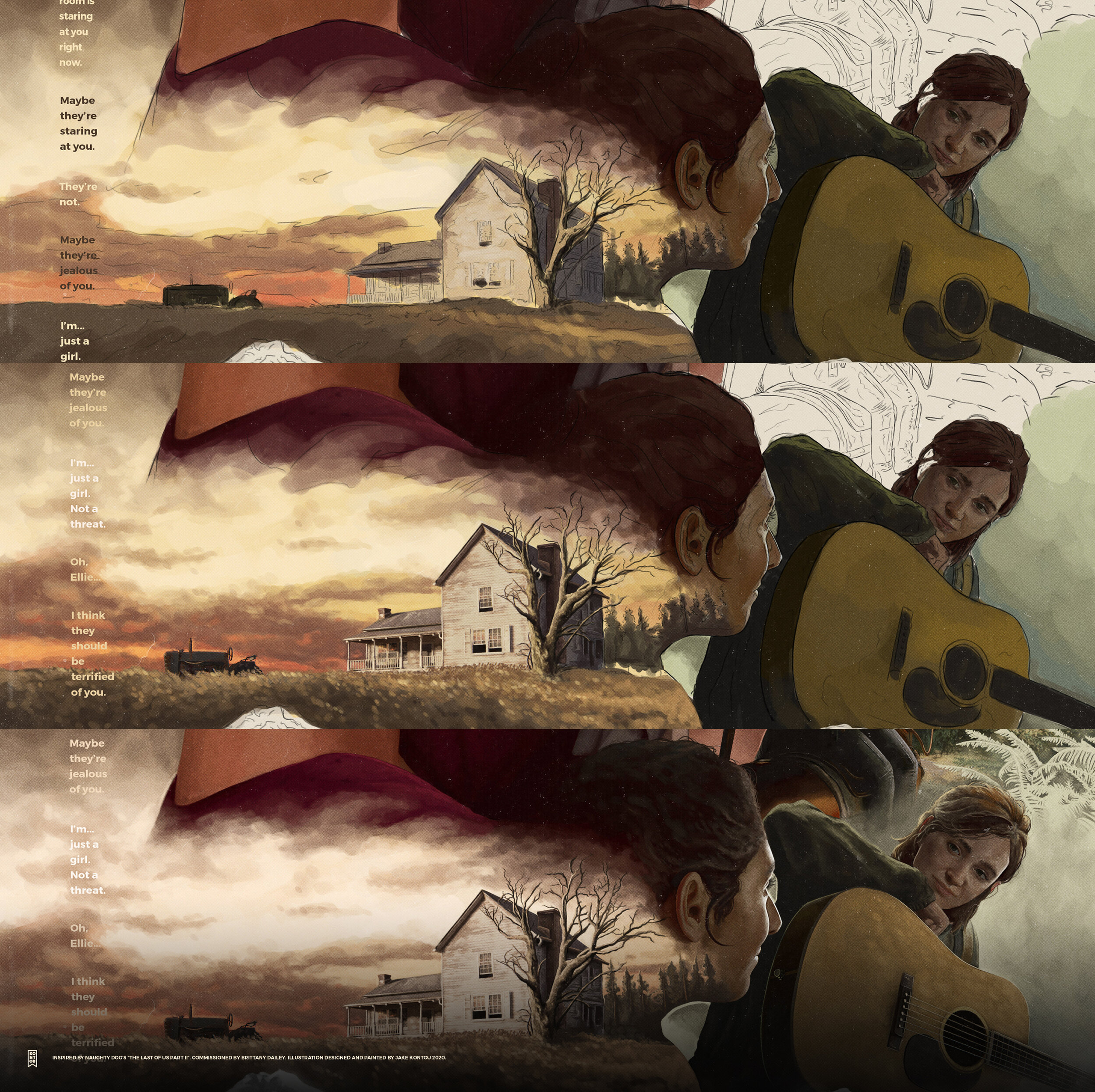
The poster was created to summarise the journey Ellie and Dina go through during the events that take place in The Last of Us Part II. From the onset, the project brief was to include the winter overlook scene, Ellie’s cover of “Take on Me” in the bookstore and both protagonists on horseback at the beginning of their journey. The decision to expand this by including their kiss during the winter dance and the stoic presence of the farm house happened early in production. These being landmarks in their relationship that helps summarise the beginning, middle and end of their journey into one flowing design.
It was key to not have the poster spoil key moments from the plot of The Last of Us Part II, shots like the farm house should be enough to provide context for those who have completed the 2020 videogame.
The contrast of cool and warmth was a heavy motive in the piece, symbolising moments in any relationship, from intimate moments to shared hardships.
Being planned from the beginning, the warmth in the design would be conceptualised as the kiss from the original E3 2018 demo, the burgundy barn house and cream bokeh from the hanging lights created the perfect backdrop to take centre stage on the poster and bleed into the other illustrations.
Created using Adobe Photoshop and Adobe Lightroom on a Wacom Cintiq.
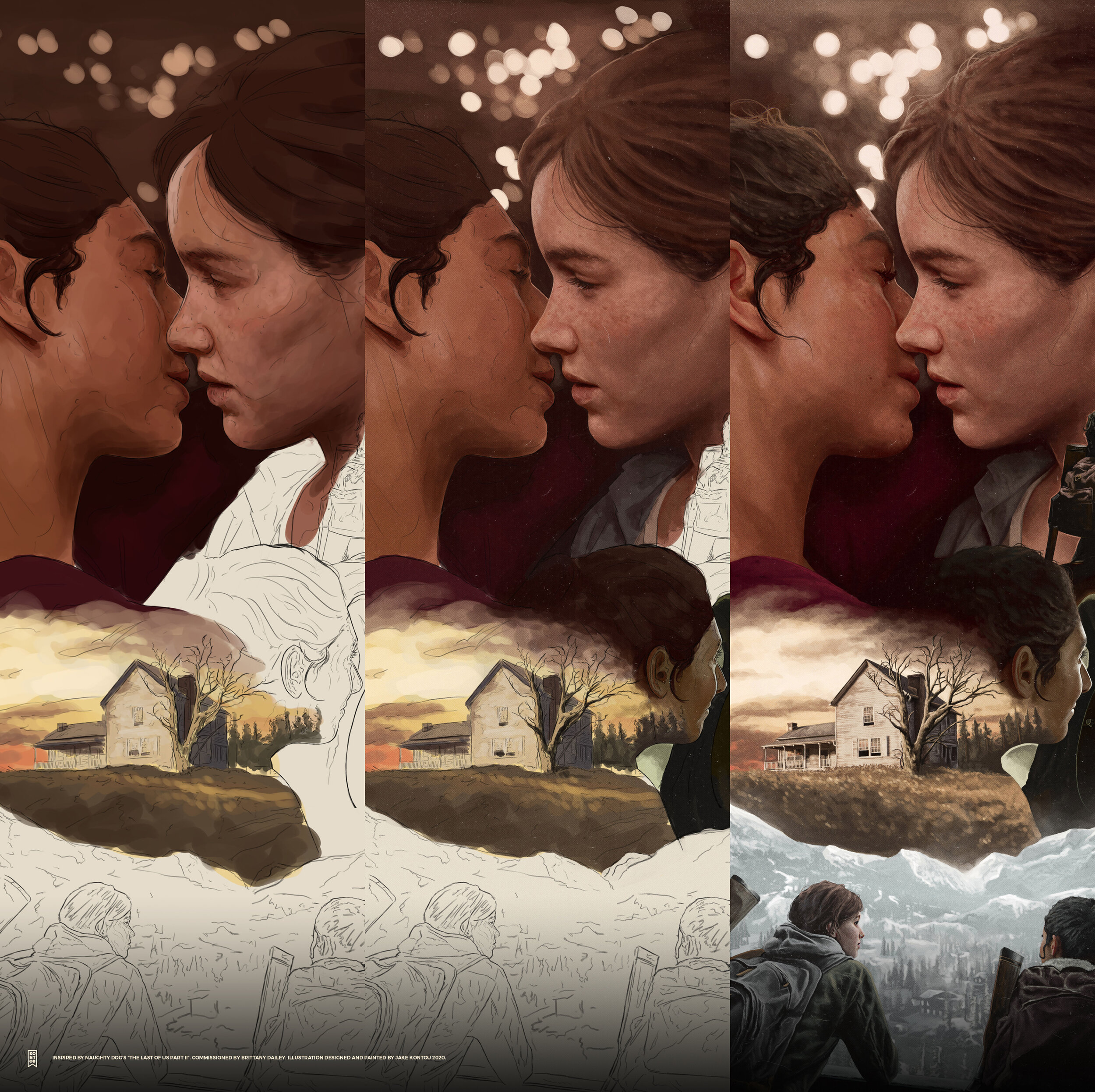
Sketch to Final.
The final art stayed very true to the original sketch, part because of the brilliant art direction from commissioner, Brittany Dailey and the additional time taken to ensure the concept was solid enough to present the themes of the poster.


